Paint is the highest rate of return on investment of almost any home makeover. A new coat in a suitable color can transform spaces without spending money on major renovations. Buyers form impressions in a split second upon entering a house, and wall color makes instant visual impressions. Proper premium paint hues can give the illusion of roomier spaces, brighter rooms, and a cozier ambiance. They can emphasize architectural elements and allow buyers to envision themselves living there.
Neutral Foundation Colors
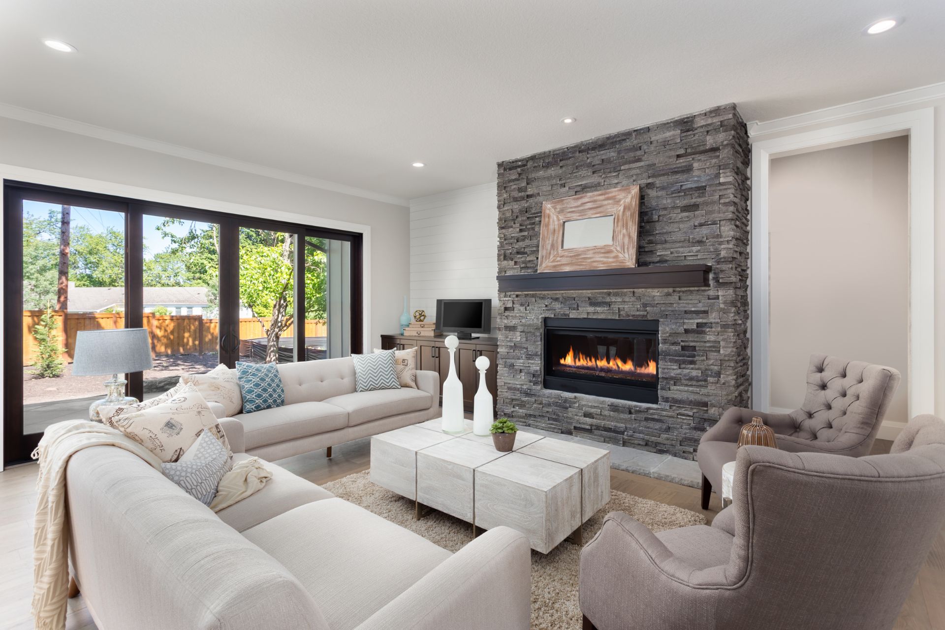
Neutral colors remain the most effective choice for selling a home, but newer neutral color schemes have evolved beyond plain beige. Modern premium neutrals have subtle undertones that add depth and visual interest to rooms. Warm whites with hidden yellow undertones recall cozy, sun-kissed spaces in north-facing rooms. Greige tones, grays blended with beige, provide sophisticated backgrounds to complement most furniture styles. The blue grays do have blue undertones but project as neutrals and provide the slightest cool sense of sophistication for formal spaces.
When selecting neutral paint, observe how much light the color reflects. Lighter colors reflect more light and give the rooms an open feeling. This comes in handy in small rooms or in rooms with limited natural lighting. Premium paint companies offer neutrals that look even in different lighting conditions. This consistency offers a more cohesive look throughout the house as consumers move from room to room.
The gloss of neutral paints has both beauty and a practical effect. Eggshell finishes in primary living areas provide a subtle sheen without highlighting wall imperfections. Satin or semi-gloss finishes in bathrooms and kitchens stand up better to moisture and cleaning. Many premium paints now come in washable forms that still look great even after they’ve been cleaned, a selling point for parents with children or pet owners.
Accent Colors That Appeal to Buyers
While neutrals are the foundation for most sellable color schemes, intelligent accent colors create interest and personality. The trick is to employ these colors judiciously and in the right locations. Soft blues create calming, serene spaces in bathrooms and bedrooms. Studies have shown that blue bedrooms and bathrooms can make a house more valuable than houses with less appealing color schemes.
Green tones connect interior spaces with nature, a feature valued by many consumers. Sage, mint, and pale olive add freshness without dominating a room. With Berkshire County homes having natural scenery, these colors can eliminate the line between indoor and outdoor living.
For dining rooms and spaces for assembly, warm neutrals with the added hint of terra cotta or muted gold create inviting environments that are both contemporary and traditional. The hues also complement wood tones in furniture and flooring, giving visual coherence through connected spaces.
Regional Color Preferences
Most popular colors vary by location, and Berkshire County buyers have their preferences. Berkshire houses generally do well with colors that complement the surrounding terrain and seasons. Warm neutrals with earthy undertones work well in rural and wooded settings. Town center houses can trend toward more traditional New England color schemes with historic references.
Vacation house purchasers respond to a little bit differently colored schemes than the primary homebuyer. For second homes, retreat and relaxation colors have the potential to be particularly effective. More relaxed, nature-oriented colors that are perhaps too calm for city primary homes would work well with weekend residents who desire relief from city living.
Weather patterns in the Berkshires also shape optimal paint choices. The extreme seasonal variation in light determines that colors will be appealing under sunny summer light as well as subdued winter light. High-quality paints with superior pigments do not change color under changing light conditions.
Color Placement Strategies
Strategic color placement maximizes appeal without compromising mass consumer interest. Placement strategies create homes that sell rapidly:
- Use the most neutral colors in the main living areas and connecting spaces like hallways
- Reserve stronger accent colors for smaller spaces like powder rooms or dining areas
- Paint ceilings lighter than walls to increase perceived height
- Keep the trim consistent throughout for visual flow
- Use the same color in small, connected spaces to create a sense of continuity
- Match cool or warm undertones throughout the home for cohesiveness
Painting smaller rooms in slightly deeper shades than bigger rooms can be used to create a sense of intimacy without making the rooms feel cramped. This is especially effective for home offices, libraries, or dining rooms where formality is desired.
Premium Paint Quality Matters
The quality of the paint directly affects the final result and consumer perception. High-end paints create richer, more durable finishes. They apply more evenly, resist fading less, and clean up better, all of which result in longer-lasting finishes. Shoppers can sense the difference between builder-grade and high-end paint, though they can’t quite put their finger on how one room looks more finished than the other.
Most upscale paint firms now offer healthier paints with fewer chemicals and less odor. These are favored by environmentally conscious consumers and those with sensitivities or allergies. The reduced odor also enables homes to be sold sooner after painting is complete.
For traditional houses characteristic of the Berkshires, high-quality paints developed to address the requirements of aging buildings can enhance period detail without compromising modern performance. These specialized products are more costly but produce results that enhance architectural integrity, a desirable selling point for certain buyers.
Current Color Trends With Staying Power
The best home sale colors mix what’s current now with what’s eternally attractive. Pure whites provide clean, gallery-like backgrounds that highlight architectural details. Warm whites with a touch of yellow undertones are inviting without being colored. Soft, dusty blues and greens with gray undertones are fresh and earthy.
Earth colors, taupes, warm grays, and soft browns appeal to natural materials like wood and stone. These colors give visual continuity from interior to exterior spaces, particularly helpful in the scenic Berkshire region.
Final Thoughts
Contact Cohen + White Associates for expert advice on selecting the perfect premium paint colors to maximize your home’s appeal to Berkshire County buyers. Our team understands local buyer preferences and can help you create a color strategy that highlights your home’s best features.